In short
Quavento Technologies designed the logo for Shruti IT Service, an infrastructure contractor in Sinnar, Nashik. The logo pairs a circular emblem with a bold blue wordmark and the descriptor IT Service. It was drawn to stay readable at small sizes on the website header, on quotations and invoices, and on boards at project sites.
Who is Shruti IT Service and what did they need?
Shruti IT Service installs CCTV, solar, fibre network and toll automation systems and carries out electrical works from Sinnar, Nashik. Its customers range from homeowners to large companies and highway operators.
A contractor's name appears in many places: on a tender document, a quotation, a vehicle, a site board and a website. The company needed one logo that looked the same and stayed readable in all of them.
What problems did the logo have to solve?
A logo for an engineering business has practical jobs to do before it has to look good.
- 01
Many services under one name
CCTV, solar, fibre, toll systems and electrical works have nothing visual in common. A picture of a camera or a solar panel would describe only one of them.
- 02
Readable at any size
The same logo has to work at the width of a phone screen and on a board read from across a road.
- 03
Fit for formal documents
Large clients see the logo first on quotations and tender papers, where it has to look established and serious.
- 04
Usable in one colour
Stamps, engraving and some printed forms allow only a single colour, so the design could not depend on gradients or fine detail.
How did Quavento Technologies solve it?
We treated this as a logo design project with a clear order of priorities: the name first, the look second.
- 01
The name as the logo
Because no single picture covers every service, the company name carries the design. SHRUTI is set in bold capitals, with IT SERVICE as a smaller line beneath it.
- 02
A circular emblem beside the name
The emblem sits to the left of the wordmark and can be used on its own as a profile picture or favicon where space is tight.
- 03
A blue that suits the trade
Blue is widely used in technology and engineering because it reads as dependable. We used one strong blue so the logo holds together on white paper and on a dark background.
- 04
Files for every use
The final logo was supplied as vector artwork with full-colour and single-colour versions, so a printer or sign maker never has to redraw it.
What did the client receive?
A logo is only useful if the client can use it without calling the designer each time.
- 01
Primary logo
Emblem and wordmark together, for the website, letterhead and quotations.
- 02
Emblem only
For social media profile pictures, the Google Business Profile and the browser tab icon.
- 03
Single-colour versions
Dark and reversed versions for stamps, boards and dark backgrounds.
- 04
Source and export files
Vector files for print and signage, and PNG files with a transparent background for the web.
Screens from the project
What was the result?
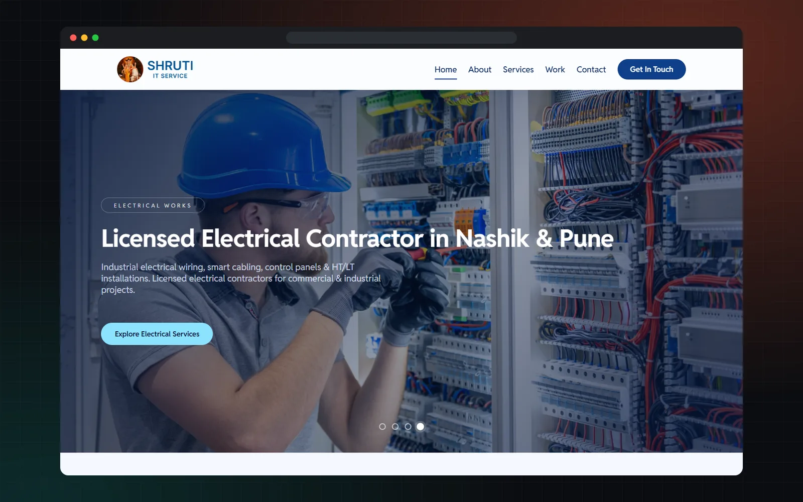
The logo is in use today. You can see it in the header of shrutiitservice.com, where it stays clear at a small size next to the navigation. The same mark is used on the company's Google Business Profile, so a customer who finds the business on Google and then visits the website sees the same identity in both places.
A logo does not produce a number you can measure on its own. Its value is consistency: one recognisable name everywhere the business appears.
What can other businesses take from this project?
If your business offers several unrelated services, let the name be the logo instead of forcing one picture to stand for everything. Test the design small, in one colour and on a dark background before you approve it.
When you need more than a logo, such as colours, typefaces and usage rules, that is a brand identity design project. Our branding services page explains the difference.
Frequently asked questions
What is the difference between a logo and a brand identity?
A logo is the mark itself. A brand identity is the full system around it: colours, typefaces, layouts and rules for using them. A small business can start with a logo and add the rest later.
Which files should I receive when a logo is designed?
You should receive vector files such as AI, EPS or SVG for print and signage, and PNG files with a transparent background for the web, in full-colour and single-colour versions.
Why use a wordmark instead of a symbol?
A wordmark puts the business name at the centre, which suits a company that offers many different services or is still building name recognition. A symbol works best once people already know the name.
Does Quavento Technologies design logos for small businesses?
Yes. We design logos for new and established businesses and supply the files you need for web, print and signage. Ask us for a free proposal.
Last updated: