We bridge the gap between elite software engineering and aggressive performance marketing to build digital monopolies for our clients.
We believe in transparent communication, agile methodologies, and treating your business like our own. No fluff, just scalable execution.
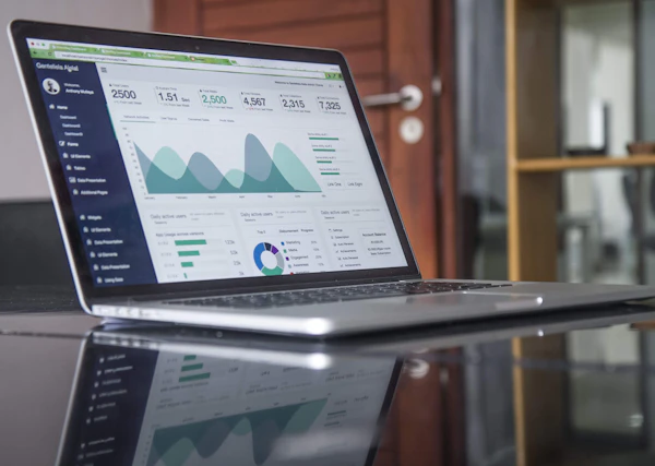
Access our live Slack channels and Jira boards. You will always know exactly what our engineers and marketers are building.
Our developers sit right next to our media buyers. When marketing needs a landing page, engineering delivers it instantly.
We operate in aggressive 2-week sprints, ensuring constant momentum and rapid adaptation to market shifts.
We offer end-to-end engineering and performance marketing services.
Headless CMS, Next.js applications, and highly secure AWS infrastructure built for extreme scale and speed.
Learn moreProgrammatic architecture, deep site audits, and high-authority link acquisition to dominate search engine results.
Learn moreAlgorithmic ad buying across Google Performance Max and Meta, mapped strictly to CPA and Lifetime Value.
Learn moreBeautiful, conversion-optimized interfaces designed in Figma and validated through rigorous user testing.
Learn moreNative iOS and Android application development using React Native and Swift for seamless mobile experiences.
Learn morePositioning, messaging, and B2B community building to establish your enterprise as a thought leader.
Learn moreDiscover a seamless integration between your team and ours. We handle the complex execution while providing you with total visibility.
"Quavento operates like an in-house team. The speed and quality of their delivery are unmatched in the agency space."
We audit your current tech stack, ad accounts, and SEO footprint to find immediate bottlenecks.
Designing the 90-day execution blueprint, mapping wireframes, and setting strict KPIs.
Deploying code, launching campaigns, and aggressively optimizing for lower CPA.
Real results, real people. Watch how Quavento Technologies transformed their businesses.
Don't just take our word for it. See what our satisfied clients have to say about their experience.
"Their digital marketing strategies completely transformed our lead generation. We've seen a 300% increase in qualified inquiries within just three months."
"The team built an incredible website for our restaurant. The new online ordering system is seamless and our sales have never been better."
"Professional, responsive, and highly skilled. They managed our SEO perfectly, helping us rank #1 for local healthcare searches in our city."
"Exceptional branding work! They completely revitalized our retail brand identity, making us stand out in a highly competitive market."
"A fantastic partner for B2B lead generation. Their paid media campaigns delivered high-quality enterprise leads consistently and efficiently."
"They redesigned our institute's website and improved our online visibility. Enrollment numbers are up, and the user experience is phenomenal."
"Their team understands digital growth like no other. The social media campaigns they ran for our hotel chain boosted our direct bookings by 40%."
"Flawless execution! They optimized our conversion rates and managed our ad spend with incredible efficiency. Highly recommended for D2C brands."
"Outstanding web development services. They delivered a complex, custom logistics tracking dashboard on time and perfectly matched our requirements."
"The branding and marketing campaigns they ran for our gym helped us double our memberships in just one quarter. Truly a game-changer!"
Learn the exact server-side rendering strategies to ensure Googlebot crawls your Single Page Application perfectly.

Stop wasting spend on branded terms. How to segment PMax asset groups specifically for B2B lead generation.

An architectural deep-dive into reducing server costs while handling millions of concurrent users during Black Friday.